Pic-thon
CLI program to stylize pictures for that one particular Pinterest aesthetic
Overview
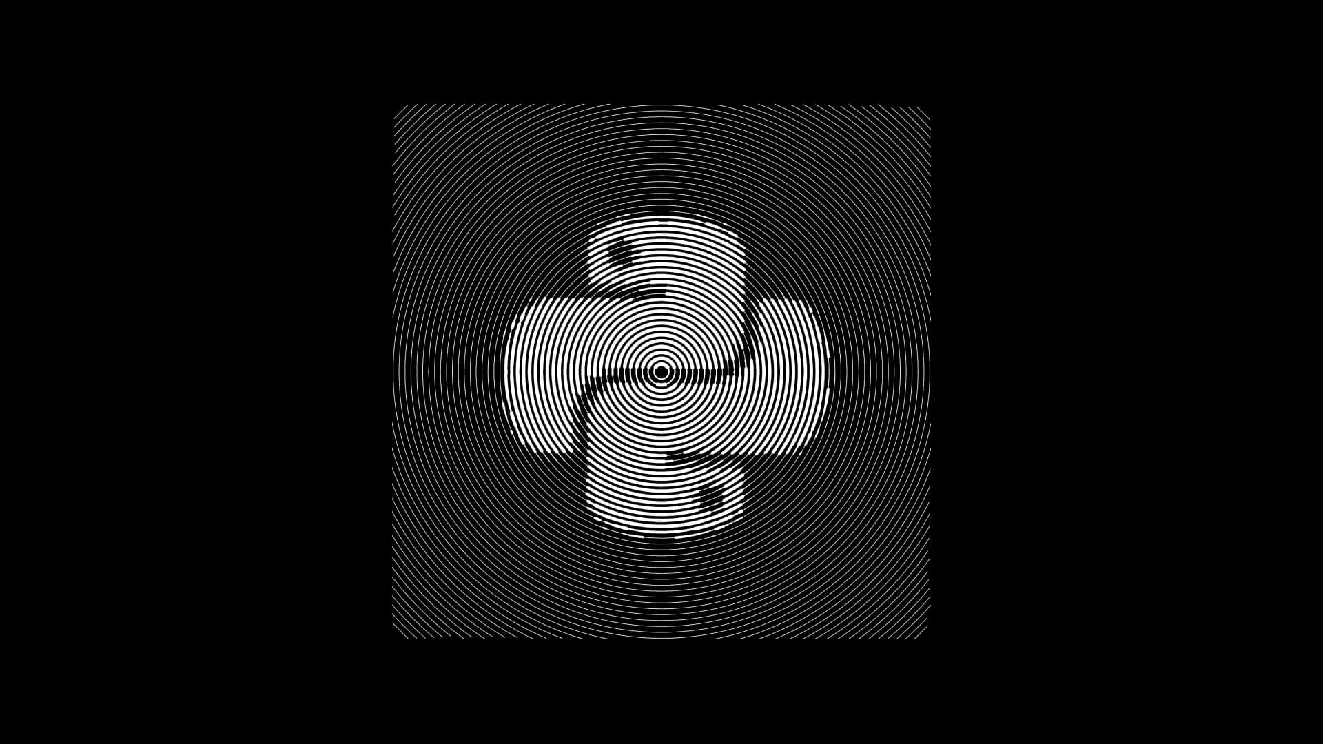
Pic-Thon started as a quick experiment to answer a simple question: how far can you push basic image data before it stops looking like a photograph and starts feeling like art. What began as a few rough scripts grew into a small but flexible Python tool that converts images into stylised, stroke-based renderings.
The project focuses on exploring visual abstraction through patterns like circular strokes, spirals, halftones, and directional lines. It is intentionally lightweight, with a command-line interface that makes it easy to test ideas, batch-process images, or tweak parameters without friction.
Behind the scenes, most of the work went into making the outputs feel consistent across different patterns while keeping the tool simple enough to extend without rewriting everything.
Problem
Most image stylisation tools either feel like black boxes or come with heavy dependencies and complex workflows. For quick experimentation, that friction slows things down.
This project addresses a more practical developer need:
- Quickly prototype visual transformations without setting up large frameworks
- Maintain control over how the transformation works
- Iterate fast without GUI overhead
There was also a personal constraint. The goal was to build something that stays understandable even after stepping away from the code for weeks. That shaped a lot of decisions around structure and simplicity.
Solution
Pic-Thon uses a grid-based approach where an input image is reduced into a lightness map. From there, different stroke renderers interpret that data into patterns such as circular, spiral, diagonal, or halftone.
Each renderer follows the same general pipeline, which made it easier to add new styles without breaking existing ones. The CLI acts as the control layer, letting you tweak:
- Stroke count to balance detail vs performance
- Grid size to control resolution
- Direction or pattern type
- Foreground and background colours
A lot of iteration went into tuning how strokes behave. Early versions either looked too mechanical or too noisy. Small adjustments like stroke spacing and ordering made a noticeable difference in how “intentional” the output felt.
The architecture stayed intentionally minimal. No over-engineering, just a clear separation between input processing, rendering logic, and output generation. That made it easier to experiment freely without worrying about side effects.
Developer Notes
Building the project is straightforward, but getting consistent visual results across devices took more effort than expected. Differences in image scaling and rendering behaviour showed up early during testing.
Build and run:
- Set up a virtual environment
- Install Pillow, NumPy, and Matplotlib
- Run the CLI via
main.py
Testing approach: Instead of formal test cases, most validation came from visual output. Generating multiple variants of the same image helped spot inconsistencies quickly. Batch scripts were especially useful here.
Anecdotes and lessons:
- Increasing stroke count does not always improve quality. Past a point, it just adds noise.
- Some patterns like spirals required multiple rewrites before they looked stable across different images.
- Halftone was deceptively tricky. Getting it to look balanced instead of cluttered took more tuning than expected.
- Keeping the CLI simple paid off. It made testing faster and encouraged experimentation.
Extending the project: Adding a new pattern mostly involves writing a new renderer that consumes the same lightness grid. Since everything flows through a shared interface, new styles can be added without touching the rest of the codebase.
Overall, the project reflects a balance between experimentation and restraint. It avoids unnecessary complexity while still leaving room to grow.